From Slope of Hope:
Via Mundi
If there’s one consistent reaction the public has to the stock market these days it is confusion. Whether bull or bear, people watching the stock market over the past three months can hardly believe their eyes. Most of them are thrilled, of course, since the so-called market seems to be virtually printing money, even in the face of horrible economic and social problems, but hardly anyone is arguing with it.
For instance, if my house in Palo Alto increased in value 5%, month in and month out, without any apparent rhyme or reason, that would be just fine by me. Would the utility of my house have increased? Would its appearance have improved? Not at all.
It would simply be worth more, and my net worth would increase, while simultaneously those who wanted to own a home in Palo Alto would be farther and farther away from their goal. The wealth disparity – – measured, in this case, in residential housing – – would be getting worse. I’d be happy. Non-home-owners would not.
Precisely the same thing is happening in stocks lately. The companies behind the stocks aren’t doing well; on the contrary, corporations are up to their necks in troubles. In spite of that, the shares that are already owned simply keep increasing in value, apropos of nothing, and the financial spread between the “haves” and the “have nots” does nothing but get wider.
The one and only reason for all of this, of course, is the Federal Reserve. Anyone who tells you otherwise is either a political hack or utterly clueless. And, given this fact, I have recently found it very helpful to look at stock values through a very different lens. Specifically, the lens of money supply.
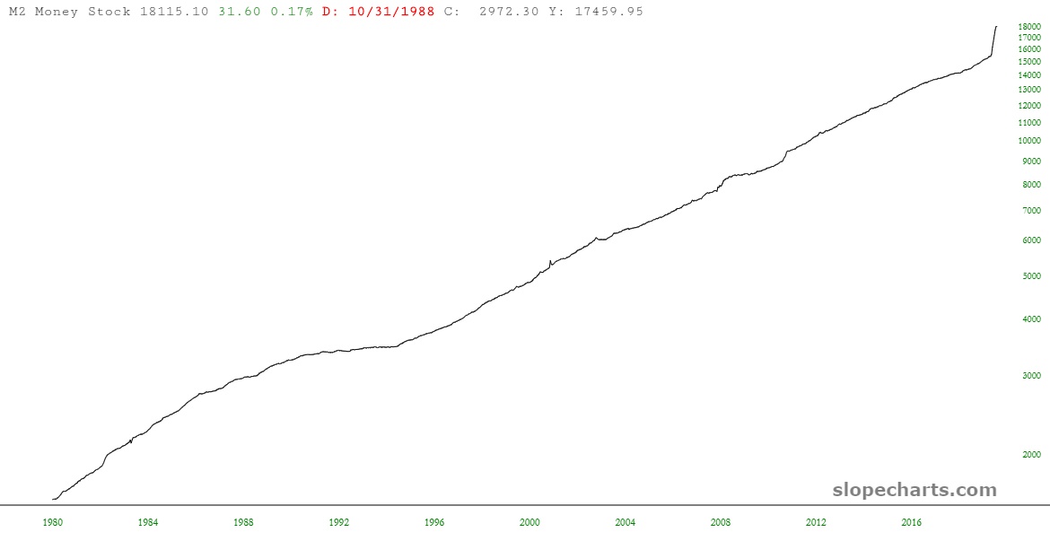
Let’s take a look at the long-term trend of the United States M2 money supply. As you can plainly see, it has been in a persistent uptrend for decades on end, not dipping even a single time. The principal characteristics of this growth is the angle of its ascent. As of March 2020, the money supply growth went from Steady to Insane.
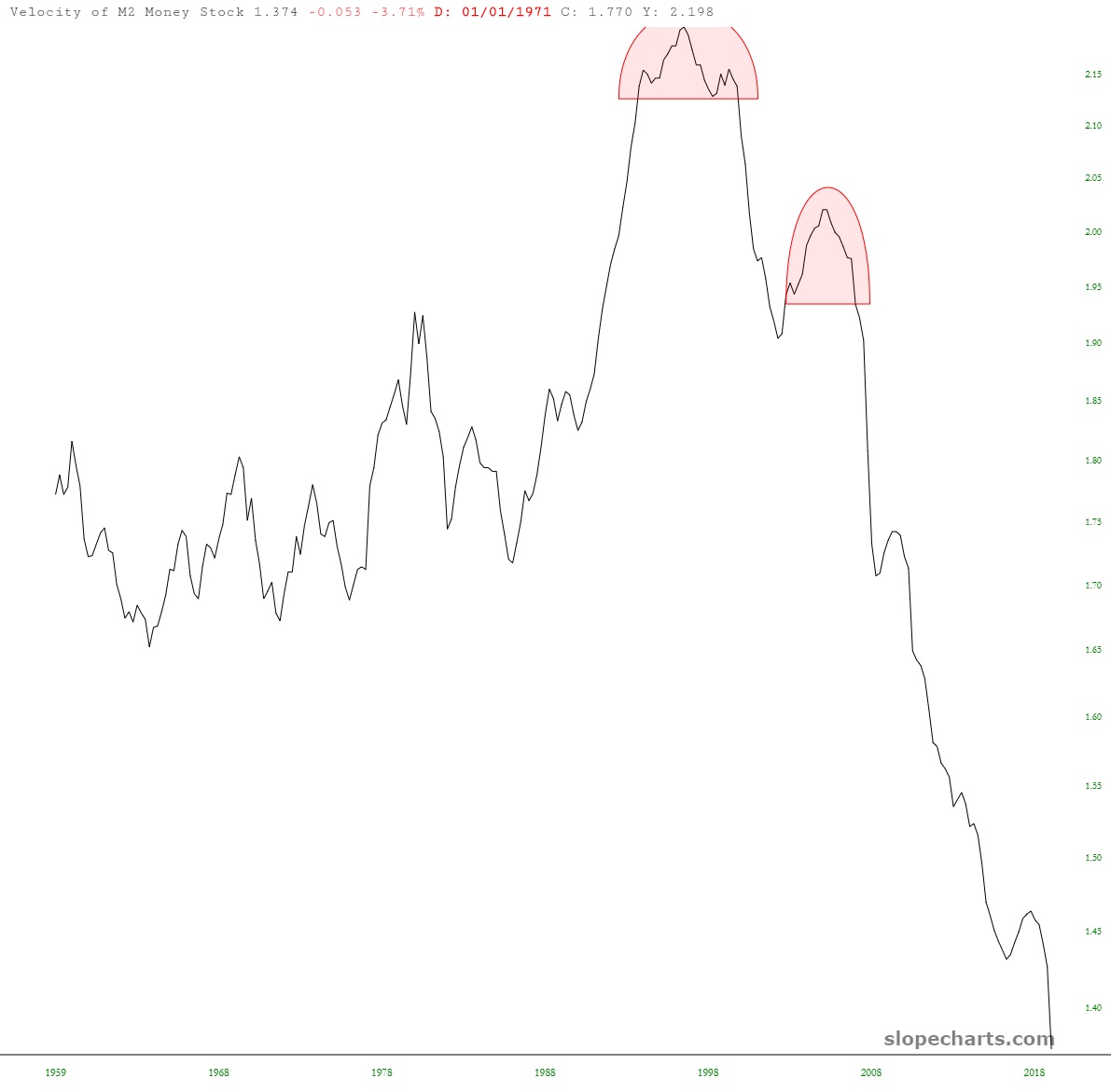
So with all of these trillions raining down upon America, the economy must be hotter than a two-dollar pistol, right? Well, the data from no less a party than the Federal Reserve itself provides an answer in the form of money velocity.
Here, over a period of many decades, is a different representation of M2. Instead of the supply of money, this chart shows its “velocity” (that is, if money is the blood of the economy, this chart suggests its heart rate and blood pressure). The chart doesn’t exactly scream “booming”.
So, wait, where does all those trillions wind up, if not ricocheting between you, your shoe retailer, your grocery store, your accountant, and your yacht salesman? Well………….the banks, maybe? After all, since the Federal Reserve is a private corporation owned by the banks, they’re a fairly chummy lot, and the chart below of the Excess Reserves at these banks does a nice job illustrating where the cash is stashed.........MUCH MORE
Recently:
Jim Cramer: The pandemic led to ‘one of the greatest wealth transfers in history’
With JP Morgan Up 7.10%, Bank of America Up 7.15% and Citigroup Up 9.23% On the Day, Let's Talk Cantillon Effect (JPM; BAC; C)