Here's the outro from a 2011 post:
*I came across Crestmont during the deflation scare of ought-two/ought-three.Here is Crestmont's plot of the relationship between historical inflation and price/earnings multiples from a 2012 post:
I was wading through the academic literature on asset class performance under various inflation regimes and came across their Y-curve on page 21 of this PDF. Good solid stuff.
Just about everything on their Stock Market page is worth a look, by pros and pups alike.
Although it takes a couple seconds to get a handle on their graphical presentation style, once you understand it you see they pack a lot of information into a graph or chart.
Here's another way to look at the relationship between inflation and P/E's. Note that both the highest inflation and deflation rates correspond with the lowest multiples accorded the earnings:.

The sweet spot high earnings multiples corresponds with inflation in the1-3% range i.e. where we are right now.The takeaway? The last ten years have been as good as it gets for the macro backdrop supporting high P/E ratios.
In tabular form:...
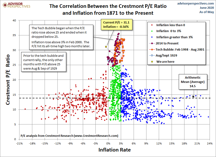
And the latest, with another type of their information dense graphics, via Advisor Perspectives, June 1:
Quick take: Based on the May S&P 500 average of daily closes, the Crestmont P/E is 115% above its arithmetic mean and at the 97th percentile of this fourteen-plus-decade monthly metric.
The 2011 article P/E: Future On The Horizon by Advisor Perspectives contributor Ed Easterling provided an overview of Ed's method for determining where the market is headed. His analysis was quite compelling. Accordingly, we include the Crestmont Research data to our monthly market valuation updates. See also his latest update: Understanding Secular Stock Market Cycles.
The first chart is the Crestmont equivalent of the Cyclical P/E10 ratio chart we've been sharing on a monthly basis for the past several years.....
*****....The Crestmont P/E of 31.1 is 115% above its average (arithmetic mean) and at the 98th percentile of this fourteen-plus-decade series. We've highlighted a couple more level-driven periods in this chart: the current rally, which started in early 2014, and the two months in 1929 with P/E above the 25 level. Note the current period is within the same neighborhood as both the tech bubble and the 1929 periods, all with P/E above 25 and is certainly in the zone of "irrational exuberance".
....MUCH MORE
Although there are more 'sophisticated' approaches to analyzing the relationship between what is a fair price to pay for an earnings stream at various levels of general inflation (think disaggregating asset-heavy from asset-light corporations for a start) there is a certain elegance to Crestmont's style.
And it beats the hell out of the old trader's rule of thumb that things are cheap when inflation + market P/E are less than 17, or whatever number the old traders used.