From Crestmont Research:
Note the graph below. When blue line inflation is high (red circles), the green line P/E is below average (yellow arrows). Whenever inflation is low (green check marks), note that green line P/E is well above average. (There’s one good incidence of deflation and lower P/E (1930s), but we’re saving that for another day…) Inflation and P/E do bounce around a bit, yet the relationship follows the financial principles described above. Some people like the chart below (generally presented without the markings) and others prefer the one known as The Y Curve Effect (both charts are available on the Crestmont Research website in the Stock Market section).

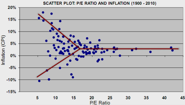
Here's another way to look at the relationship between inflation and P/E's. Note that both the highest inflation and deflation rates correspond with the lowest multiples accorded the earnings:
.

The sweet spot high earnings multiples corresponds with inflation in the1-3% range i.e. where we are right now.
In tabular form:

Source: Crestmont Research
Finally note that the three big bull markets of the last century were fueled more by P?E multiple expansion than by growth in earnings:

More to come. If you want to get a handle on Crestmont's approach the Financial Physics section is a good place to start.