From FT Alphaville:
Creative destruction concerns
The dual axis, like many charting tools, has its limitations. Used well, it can suggest links between two data points which may be harder to explain with text.
Take this one from Moody's, which Colby highlighted in her post on covenant-lite leveraged loans last week:

Yet, in the wrong hands, these charting tools of mass destruction can be used to prove, well, nearly anything. Take the apparent correlation between Nick Cage films and people drowning in swimming pools, for instance:

Another (not quite as egregious) example was spotted by Alphaville over the weekend on the Twitter account of macro trader Sven Henrich, who runs the Northman Trader website.
He plotted the share price performance of stricken US conglomerate General Electric and its performance versus the S&P 500, with a rather leading comment:
...MORE— Sven Henrich (@NorthmanTrader) November 16, 2018
The Northman Trader chart we were looking at was going to be headlined:
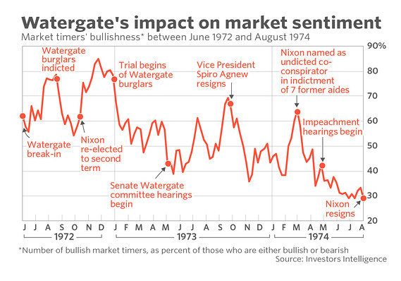
Jeez, ya think the Yom Kippur War, the oil embargo/crisis and the 694-day equity bear market had anything to do with declining market sentiment?
A long headline but compared to the simplism of the chart annotation well worth it for accuracy.
For what it's worth the bear market lasted from 11 January 1973 to 6 December 1974.
As noted in one of the links from the post immediately below, "High Yield: Well Would You Look at that (HYG, JNK)":
Following Up On: "The Coming High Yield Downturn Will Be Big, Long, And Ugly" " (HYG; JNK)
The old timers used to get very somber when talking about the 1973-1974 equity bear market.Spurious (deceptive) correlation indeed.
The thing, they said, was that it just kept grinding lower and lower, for 694 days.
By comparison the 2007-2009 decline lasted 517 days, though deeper at a 54% drop in the DJIA versus 45% (43% on a closing basis) for the index in the earlier bear.
On the London Exchange the 73-74 collapse was 73% in the FT 30 and 68.5% for the wider market.
But then there was the inflation.
British inflation rose 10.6% in 1973 and 19.1% in 1974. And although lower, the comparable figures for the U.S. were the same order of magnitude, 8.7% and 12.3%.
The inflation adjusted declines were thus just that much worse and among the worst real returns in history—excluding of course the Berlin Stock Exchange up to 1945 and the FX market for the shekel/denarius cross in the year 70, what with the destruction of Jerusalem and the Temple and all....