9. Driving Shifts Into Reverse

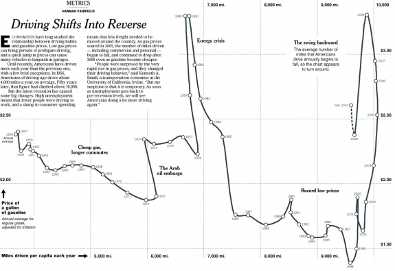
Hannah Fairfield, former editor for The New York Times, and now graphics director for The Washington Post, had a look at gas prices versus miles driven per capita. The chart could've easily been an x-y scatterplot, but the extra step was taken to connect the dots so to speak. Points were ordered by time, and turns were clearly explained graphically.
7. What Online Marketers Know About You

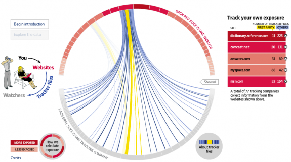
Along the same privacy lines, this project from Andrew Garcia Philips and Sarah Slobin (plus five data gatherers) of The Wall Street Journal explored what online marketers know about you. I wouldn't say the visualization itself was super advanced, but thoughtful reporting and company breakdowns really made the whole piece work.
Eight MORE
HT: Marginal Revolution