You may remember it from Beyond Meat, this time it is the futures on the 10-year U.S. Treasury note:

The most important life lesson applicable to trading the pattern is: patience.
DO NOT try to anticipate a continuation lower. If it is going to happen, it will happen and you can hitch a ride south. And note the volume. After the money flooded into treasuries during the mid-March bank runs, prices continued to chop up and down on double current volume for another week.
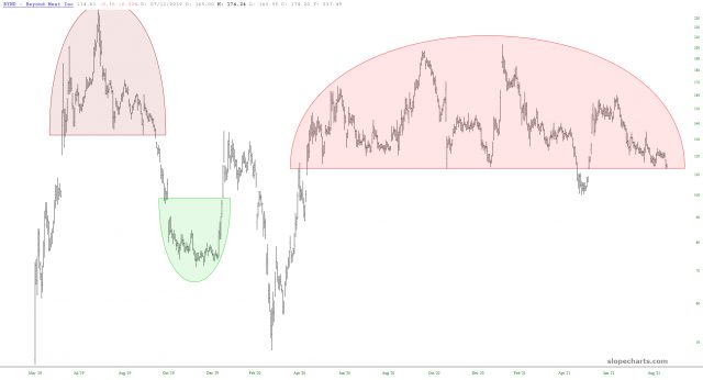
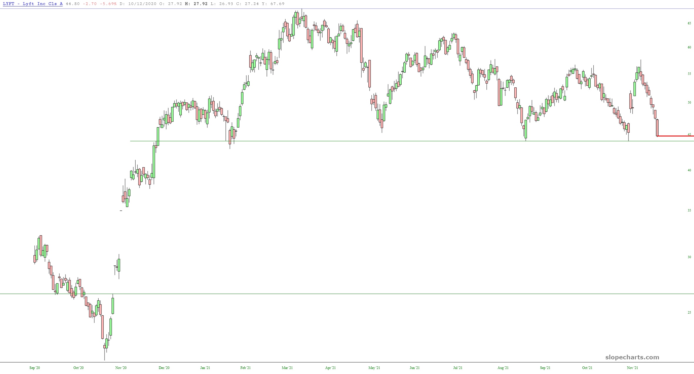
Here's a 2021 post on a couple previous opportunities (examples BYND: $114 to $11.42 last; LYFT: $45.48 to $8.34 last):
We try to filter for busy reader the higher probability directional bets.
Not necessarily the highest risk/reward or possible return and definitely not some of the combination trades you can put together with derivatives. Just Up or Down. If you get that right, even just 51% of the time, you are halfway home to the fancier stuff. Or, as the four basic combinations were called back in a more testosterone-y, less dopamine-y trading environment: Strip, Strap, Straddle and Spread.
With that longer than usual introduction here are the two charts that Tim Knight at Slope of Hope proffered that elicited a "Saaaay, I've seen that pattern before":
BYND at $114.31 -0.67 last on the day we posted it, September 7:


Big Caveat: You don't want to try to anticipate the fall through the support line. Be willing to give up some potential profit by making sure you aren't hallucinating or trading on FOMO (to the downside).
Here's an example of why. Originally posted August 18:
People who spend too much time at the market have this image burned into their retinas but it is worth highlighting, if for nothing else, the opportunity to see how these things resolve.
From Slope of Hope, August 17:
The small caps (as represented by the ETF symbol IWM, below) has been range-bound literally all year long. The reason, of course, is that the Federal Reserve has totally captured and controlled this market, and it knows all too well the kind of holy hell that will break loose if they stop pouring literally trillions of dollars directly into the pockets of their banker friends.
I will say, however, that ever so slowly, the small caps are indeed starting to chip and wither away. The horizontal lines make plain the breakdown required.

....MORE (there appears to be some downside potential)
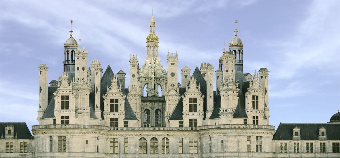
The pattern, to the amateur eye, may bear a superficial resemblance to the 28 step Three Peaks and a Domed House pattern:

But it is actually closer in structure to the more symmetrical Palais des Beaux-Arts de Lille Set-up:


Better to go off on some architectural tangent than to risk capital by being early.