From Doug Short's Advisor Perspective::
Inside the Consumer Price Index
Note from dshort: The charts in this commentary have been updated to include the November Consumer Price Index news release for the October data.
The Fed justified the previous round of quantitative easing "to promote a stronger pace of economic recovery and to help ensure that inflation, over time, is at levels consistent with its mandate" (full text). In effect, the Fed has been trying to increase inflation, operating at the macro level. But what does an increase in inflation mean at the micro level — specifically to your household?
Let's do some analysis of the Consumer Price Index, the best known measure of inflation. The Bureau of Labor Statistics (BLS) divides all expenditures into eight categories and assigns a relative size to each. The pie chart below illustrates the components of the Consumer Price Index for Urban Consumers, the CPI-U, which I'll refer to hereafter as the CPI.
 The slices are listed in the order used by the BLS in their tables, not the relative size. The first three follow the traditional order of urgency: food, shelter, and clothing. Transportation comes before Medical Care, and Recreation precedes the lumped category of Education and Communication. Other Goods and Services refers to a bizarre grab-bag of odd fellows, including tobacco, cosmetics, financial services, and funeral expenses. For a complete breakdown and relative weights of all the subcategories of the eight categories, see the link to table 1 near the bottom of the BLS's monthly Consumer Price Index Summary.
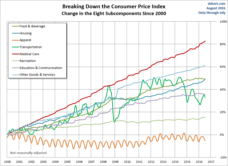
The chart below shows the cumulative percent change in price for each of the eight categories since 2000.
Not surprisingly, Medical Care has been the fastest growing category. At the opposite end, Apparel has actually been deflating since 2000. The latest Apparel number is the first fractional nudge above zero in about nine years. Another unique feature of Apparel is the obvious seasonal volatility of the contour....MORE
