Nah.
From The Verge:
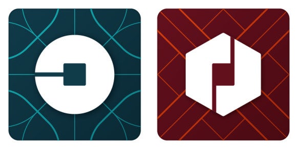
If you update your Uber app today, you might notice something is a little different: gone is the "U" logo, replaced with a... circle thing. Uber describes the square at the center of the new logo as the "bit," something that will appear throughout the design of the company's site and redesigned app. Uber wants to focus on that bit, which it says will make it easier to add additional products to its portfolio over time — you'll always see that bit at the center, the theory goes, and you'll identify it as an Uber product. Uber has been aggressively expanding into adjacent services like food delivery lately, so that explanation makes some sense.Via Gizmodo:
Uber's press release describing the changes — written by CEO Travis Kalanick himself — says that the new branding "celebrates our technology, as well as the cities we serve," and gets rid of the stark black-on-white appearance in favor of muted colors that vary depending on region. "The team has spent months researching architecture, textiles, scenery, art, fashion, people and more to come up with authentic identities for the countries where Uber operates," Kalanick says....MORE
Updated: Wired has a piece on the new (and colorful) redesign. The logo we’re seeing everywhere is the “rider” one, with another “partner” one:

Uber’s app takes longer to open thanks to its new logo