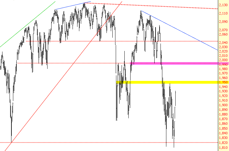
S&P 1,926.82
From Slope of Hope:
Mellow Yellow Right Said Red
Some people are more fun when they’ve had a few drinks. I, on the other hand, am a lot more fun with the market is in a free-fall. Those of you who watch me on Tastytrade probably know this already. I’m cheerful, chatty, and chipper when the market is getting wiped out. However, when talk of stimulus, easing, and more government whoredom sends markets sailing higher, and my own readers (particularly those with interchangeable names) start tossing about terms like “beartard” (on my own blog; have you no decency, at long last, Senator?), my mood darkens considerably.
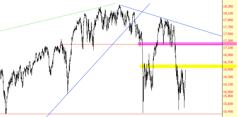
This evening, I took a hard look at the big charts to try to figure out when resistance was going to kick in (although after the past four days, one wonders if resistance will ever engage again at all!) Below I’ve tinted in yellow the areas of “medium” resistance, and in magenta the areas of stronger, more formidable resistance. Given that we’ve slapped over 1,000 Dow points onto the market in the span of just a few days, producing what ZH is calling the biggest short squeeze in 7 years, I’d really appreciate if the Market Gods would use the yellow tint instead of making me wait for the crimson.
Here’s the Dow Industrials:
----------