Each of the 308 million dots are smaller than a pixel on your computer screen at most zoom levels. Therefore, the "smudges" you see at the national and regional levels are actually aggregations of many individual dots. The dots themselves are only resolvable at the city and neighborhood zoom levels.
-Weldon Cooper Center, University of Virginia
Via I Love Charts: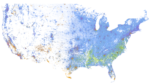
I’ve seen lots of USA race maps based on the 2010 census data, but this one is my favorite both for detail and aesthetics. Each dot represents a single person, but at most zoom levels those dots are smaller than a pixel, so what you get is a blend of colors. In the map above, blue dots are for people who identify as White, green dots are for those who identify as Black, red is Asian, yellow is Hispanic, and brown is anything else. You can see the interactive map here or learn more about it here.