From The Economist's Graphic Detail, Nov. 10, 2010:
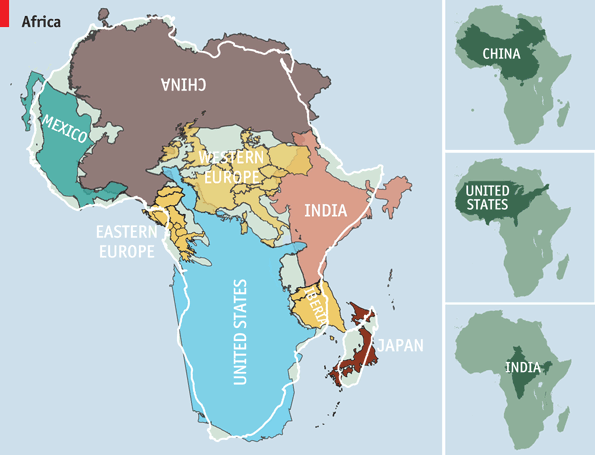
LAST month Kai Krause, a computer-graphics guru, caused a stir with a map entitled "The True Size of Africa", which showed the outlines of other countries crammed into the outline of the African continent. His aim was to make "a small contribution in the fight against rampant Immappancy"—in particular, the fact that most people do not realise how much the ubiquitous Mercator projection distorts the relative sizes of countries.[the link used by The Economist has died, here's a fresh version]
A sphere cannot be represented on a flat plane without distortion, which means all map projections distort in one way or another. Some projections show areas accurately but distort distances or scales, for example; others preserve the shapes of countries but misrepresent their areas. You can read all the gory details on Wikipedia.
Gerardus Mercator's projection, published in 1569, was immediately useful because it depicts a line of constant bearing as a straight line, which is handy for marine navigation. The drawback is that it distorts the shapes and areas of large land masses, and the distortion gets progressively worse as you get closer to the poles. (Africa looks about the same size as Greenland under the Mercator projection, for example, even though it is in fact 14 times bigger.) This was not a big problem for 16th-century sailors, of course, and the Mercator projection remains popular to this day.
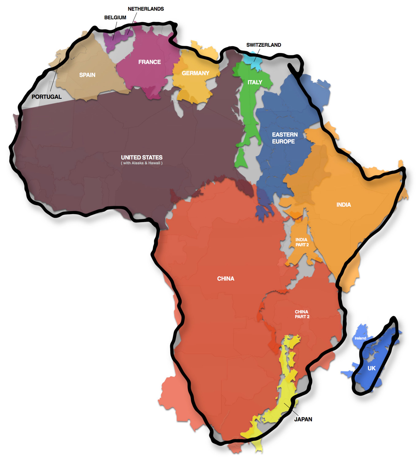
In Mr Krause's map (above) he seems to have used the shapes of the countries from a Mercator projection, but has scaled up the outline of Africa, without changing its shape, to show the appropriate area. An alternative and arguably more rigorous approach would be to repeat the exercise using an "equal area" projection that shows the countries' areas correctly while minimising shape distortion. These two properties are the hardest to balance when showing the whole world on one map. I decided to rework Mr Krause's map using Gall's Stereographic Cylindrical Projection (1855) with two standard parallels at 45°N and 45°S. Distortions are still evident at the poles, but for most countries shape is maintained, and their areas are shown correctly. As you can see (below), the results are distinct from Mr Krause's map. But however you look at it, his point is a good one: Africa is much bigger than it looks on most maps.