Lifted in toto from The Big Picture:
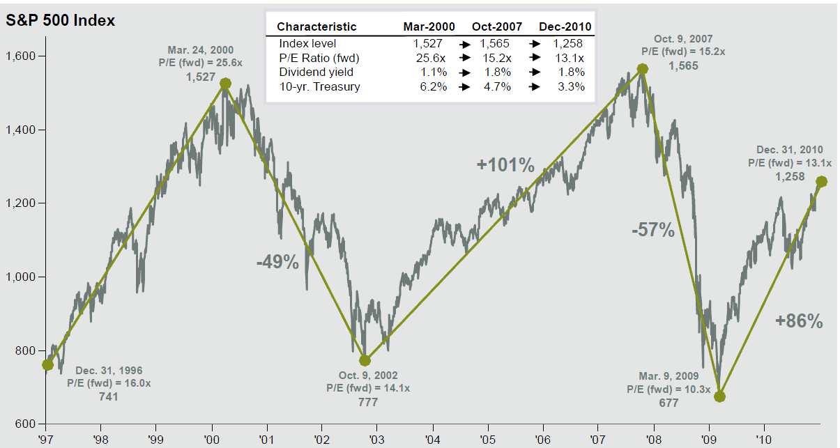
Dr. David P. Kelly, of JP Morgan Asset Management puts out a monthly deck laden with great charts. This chart — the Buy & Holder’s worst nightmare – really caught my fancy:
>
click for ginormous graph

Source: Standard & Poor’s, First Call, Compustat, FactSet, J.P. Morgan Asset Management. (Data is up til 12/31/10)
>
Notes: Dividend yield is calculated as the annualized dividend rate divided by price, as provided by Compustat. Forward Price to Earnings Ratio is a bottom-up calculation based on the most recent S&P 500 Index price, divided by consensus estimates for earnings in the next twelve months (NTM), and is provided by FactSet Market Aggregates. Returns are cumulative and based on S&P 500 Index price movement only, and do not include the reinvestment of dividends.