From The Capital Spectator:
You can find any answer you want by comparing the current curve to
various points in its history. Over the past 30 trading days, for
instance, the curve is more or less unchanged. But comparisons over
longer periods reveal a modest flattening.
A flatter curve may be a precursor to an inverted curve, which would
cast a bearish shadow over the economic outlook. As economists are fond
of pointing out, inverted yield curves (short rates above long rates)
tend to precede recessions. In other words, the normal state of the
curve (higher rates for longer maturities) is turned on its head when
the state of macro turns dark.
The question is whether the yield-curve signal for estimating
business-cycle risk has been rendered null and void thanks to
manipulation of short rates in the extreme by the Federal Reserve via
extraordinary monetary policy? That’s an ongoing debate, and threatens
to remain so for some time. Meanwhile, let’s take the curve at face
value and ask: Is it flattening?
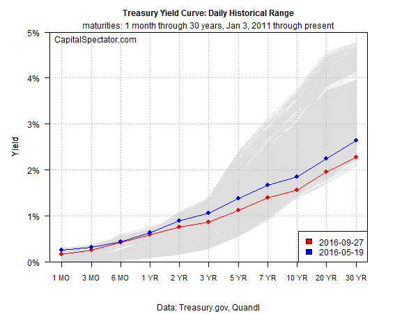
One way to keep the spin to a minimum is to look at the current shape
of the curve in context with history. For example, the chart below
shows the current set of yields (red line) as of yesterday, Sep. 27,
based on daily data from Treasury.gov. The historical range of daily
curve data since 2011 is depicted in gray. The main takeaway: short
rates are near the top of this range while long rates are approaching
the bottom.

In sum, the curve is relatively flat compared with the last five years.
But that’s been true for some time. The question is whether it’s
becoming even flatter compared with recent history? Let’s consider one
example—90 trading days as the look-back window. By that standard, the
curve has become a touch flatter, as shown above by the red line dipping
below the blue line across the yield spectrum....MORE
