From Medium:
I’ve it up here, here & here, a version of Goodhart’s views can be
found in Prospect and
Nangle’s original at VoxEU (and I’d bet it’s one of very few documents published by a fund manager in 2015 that references Lenin on imperialism).
Goodhart-Nangle
is an explanation of the past thirty or so years and a prediction about
the future and whilst the Goodhart and the Nangle versions differ,
there’s a substantial overlap.
Briefly put, the story runs as follows:
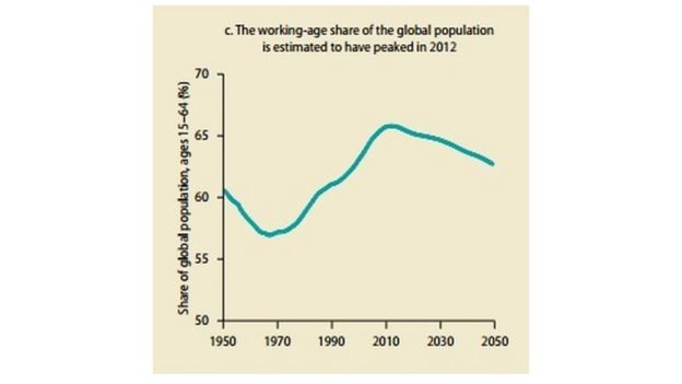
- A
combination of the demographic sweet spot (a rising proportion of the
population being of working age) and globalisation (the great doubling
of the global workforce available to Western capital post-1990) resulted
in a global glut of labour.
- Faced
with an oversupply of workers, the relative price of labour fell
pushing down the labour share of national income in the advanced
economies and depressing wage growth.
- The availability of cheap labour reduced the need for labour saving, productivity enhancing capital investment in the West.
- Lower demand for capital (and less inflationary pressure from wages) reduced real interest rates.
The
result: lower inflation, weaker wage growth, lower investment, falling
real rates and rising inequality. The symptoms of what some see as
secular stagnation but what are to Nangle a reflection of the fact that
labour bargaining power sets the natural rate.
But
demographics have turned. And Goodhart-Nangle predicts that with this
turn, three multi-decade trends (weak wages, falling real rates &
rising inequality could turn to).
Like I say, the most interesting theory of the year.
But is it right?...
...
MORE