At NFTRH, we are about major macro turning points above all else. Of course, it is often years between these turning points or points of significant change so we are also about the here and now, and managing the trends, Old Turkey style.*
Since we are all learning all the time, I have no problem admitting to you that while right and bullish on commodities and stocks in 2009, after becoming bullish on the precious metals in Q4 2008, I completely ignored Old Turkey due to my inner biases. The result has been that after taking excellent profits from the precious metals bull, personally, I have greatly under performed the stock market bull despite holding a bullish analytical view for the majority of the post-2012 period.
Undeterred and ever plucky, we move forward. Currently, I play the bullish stock market like millions of other casino patrons, but this is as a trader and portfolio balancer, with the goal always to be in line with the macro backdrop of currency moves (I’ve been very long the US dollar for a few months now) and Treasury/Government bond yields and yield relationships.
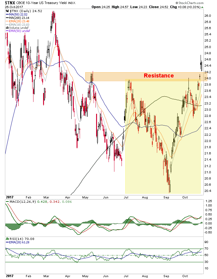
This week something happened that has gotten me geeked out like at no other time since Q4 2008, when it was time to put the real precious metals fundamental view (as opposed to commonly accepted gold bug versions) to the test and go all-in. This week, assuming it is confirmed by remaining active through the FOMC next week, we got a short-term signal in Treasury bond yields that starts the clock ticking on a big macro decision point, which may include an end to the stock mania and the beginning of a sustained bull phase in the gold sector, among other things.
But first, we need to understand that the macro moves at an incredibly slow pace and one challenge I have had is to manage what I see clearly out ahead with the extended periods of intact current trend that seem to take forever to change. We as humans (and quants, algos, black boxes, casino patrons and mom & pop) are increasingly encouraged to try to compute massive amounts of information in real time and distill a market view from that at any given time, all at the behest of an overly aggressive financial media that wants to harvest your over exposed, bloodshot eyeballs on a daily, no hourly basis.
I’d only argue that you try not to get swept up in the noise; that you try to consider the much slower big picture, especially when it is on the verge of indicating changes. So, long preamble behind us let me show you what is going on in bonds, which is where the markets have been routinely manipulated by the Federal Reserve (through QE 1-3, plus Operation Twist and 7 years of ZIRP) and thus, is ground zero for coming events.
As noted earlier in the week, 10 and 30 year yields have made bullish breakouts on the daily charts. These patterns target 2.8% on the 10yr and 3.2% on the 30yr.
....[30-year chart omitted]
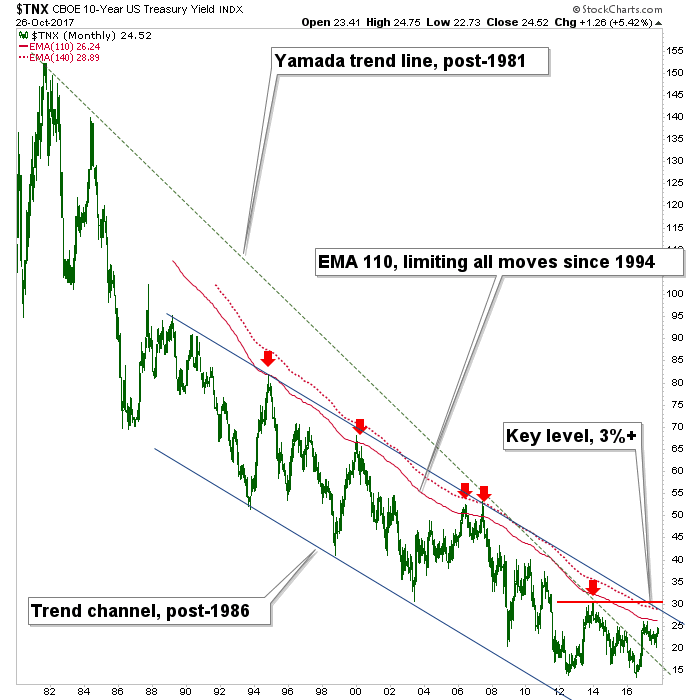
Now dialing out to the bigger picture, we have our limiters (to speculation) that have been in place for decades. To review, this chart noted the “Yamada trend line” back in December of 2016 in order to cast derision upon the Bloomberg headline R.I.P. Bond Bull Market as Charts Say Last Gasps Have Been Taken as a celebrity TA drew a single line on a long-term chart and Bloomy fell all over itself to turn it into a sensational headline. Bonds then went up for the better part of a year.
What is actually important on this chart are the limiters at the red dotted monthly EMA 140, the channel top and lateral resistance from the late 2013 high when the media were busily honking the “GreatPromotionRotation”. The TNX limiter is at 2.9% (+/-), which is in essence, the measured target of the daily chart pattern above! [I hardly ever use ‘!’ in my writing, but this warrants an exception].
...MORE