From Big Think, April 7:
Gray took over the modern world. Now, color may be returning.
The ideology, economics, and psychology behind the modern world's draining of color from homes, cars, and everyday objects.
(Credit: All Star Home/Martha Stewart)
by Frank Jacobs
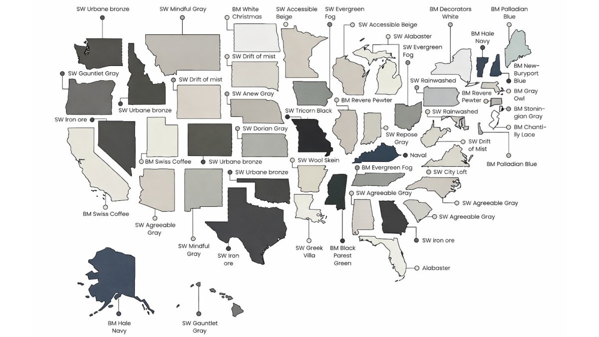
No, you haven’t suddenly gone colorblind. This map is in color. In fact, it is a map of color — specifically, of each U.S. state’s favorite house paint color. It’s just that those favorites look like a swatch book for a funeral parlor — like fifty shades of gray.
Well, gray-ish. From Hawaii to Maine, from Alaska to Florida, the most popular shade for your home’s exterior is some variation of gray, off-white, beige, or greige — a hue so existentially undecided that it can’t commit to being either gray or beige, and so ends up neither, and both.
Dipped in a vat of Resigned Indifference®
But how can this be? America is anything but monochrome. It contains multitudes of cultures, climates, and landscapes, and people who disagree, loudly and publicly, about nearly everything. So why, when Americans need a tin of house paint, do they so often reach for the neutral shelf? Why does the average house in this great and varied nation look like it’s been dipped in a vat of Resigned Indifference®?
The answer is a phenomenon dubbed “the grayening”: a gradual but relentless draining of pigment, not just from exteriors but also from interiors and from the stuff of everyday life, like cars and phones. In 2020, researchers at the Science Museum Group in London found evidence of the trend’s longevity. Feeding roughly 7,000 photographs of everyday objects — kettles, lamps, cameras — from the late 1800s to 2020 into an algorithm, they then asked it to track color distribution over time.
The result: a striking shift toward achromatic — that is, neutral — colors in material culture.

The grayening has accelerated in the 21st century, but it has ideological roots in the 20th, and industrial ones in the 19th.
Early 19th-century objects tended toward natural material colors: the warm brown of wood and leather, the yellows and brass tones of metals. Over time, those pigmentations surrendered steadily to black, white, and gray.
The shift was slow but steady, and its cumulative effect was massive. By the late 20th century, grayscale had colonized and dominated a wide range of object categories. To a large extent, this desaturation is a byproduct of mass production. Industrial manufacturing favors repeatability. Neutral tones are easier to standardize, less likely to clash, and more globally marketable than a particular shade of tangerine, which may sell brilliantly in Seville but offend everyone in Seoul.
In that sense, grayscale is the muted lingua franca of global commerce: inoffensive because it says nothing at all. But the grayening is more than simply an accident of industrialization. In the early 20th century, it got a powerful philosophical boost from modernist design ideology.
“Suited to simple races, peasants and savages”
In his 1908 essay “Ornament and Crime,” Austrian architect Adolf Loos argued that ornamentation was not merely unnecessary, but a sign of arrested moral development. Truly evolved people, he suggested, would gravitate toward clean lines and plain surfaces. Applied ornament, including the use of color as decoration, didn’t enhance; it cluttered and distracted.
Loos’s polemical target was Art Nouveau, then in full frothy bloom. His arguments were influential on the Bauhaus school of art, which canonized restraint and straight lines. It, in turn, informed the International Style that swept global architecture from the 1930s onward, a style that favored glass, steel, and concrete. All gray: not just by default, but as a statement of seriousness.
Le Corbusier, pioneer of what we now simply call modern architecture, made the point with characteristic charm, declaring that color “is suited to simple races, peasants and savages.” Ouch.
The desaturation didn’t stop at buildings. Car colors have been meticulously catalogued since the dawn of the automotive age, making them a useful proxy for the broader culture’s chromatic pulse. Black had its first heyday as a car color about a century ago, when Henry Ford famously quipped that his Model T was available “in any color the customer wants, as long as it’s black.”
The last, best decade for bold car colors...
....MUCH MORE