I was the first person to call Mark Zuckerberg in 2004 and offer to buy the company (I was running Bolt at the time). In March, 2010, I published the first Wall Street style research report on Facebook on a Tumblr blog, with a $100 billion five year price target (it was actively trading in the private markets at $16B). For a brief while, I went back to Wall Street as a “Social Media Analyst” where I upped my target valuation forFacebook to $200 billion (per this clip of me on Bloomberg TV in late 2010)
My 2014 revenue forecast was off by just 1%, because I focused on user engagement. As Facebook continued to increase user engagement, I continued to be a Facebook bull. I believe that social media platforms are either growing user engagement, or they’re dying. And for eight years, Facebook was growing user engagement.But Facebook’s Q4 ’17 earnings, released on January 31st, 2018, revealed the first decline in user engagement in Facebook’s history. Facebook gave the excuse that they were purposefully trying to prevent Facebook users from doing the #1 thing they liked to do on Facebook. Facebook was finally trying to stop fake news. I didn’t care about the excuse. So I turned bearish, penning this blog post to note the occasion.It’s been 18 months since that post, and Facebook shares has underperformed the NASDAQ (up 5% vs. 15% for the NASDAQ). More telling, Facebook has dramatically underperformed it’s peer group (which I define as FAMGA), which averaged a gain of 33% over the past 18 months.

I believe Facebook will continue to underperform the NASDAQ and their peers, because of one simple graph.
The Graph That Shows Facebook Is Dying...
....MORE
Coming up next, "How many noodles make a spaghetti graph unreadable?"
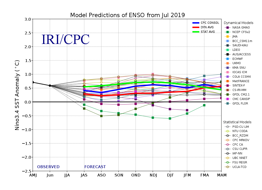
Just kidding, the one above is clear enough to follow the lines, more like this El Niño Southern Oscillation forecast from IRI/Columbia:

Although even here if you use enough distinct colors you can get the message.
And fortunately enough, the message one wants to be aware of is one of the outlier projections, NOAA's CFSv2, the green line under the zero degree anomaly.
If that model run comes to pass we are looking at a full blown La Niña.
Which would explain why the commercials are getting long natural gas futures.